For several years I’ve been hearing variations on the theme “Navigation is dead.” As screen-size and attention spans get smaller, we shove navigation out of the way. We’ve ditched our dropdowns. We stick it in the footer. We hide it behind hamburger menus. “Navigation isn’t how users browse the web” we say.
Let me tell you a story of a time when navigation mattered. To me.
Earlier this year, my daughter was diagnosed epilepsy. It’s a crazy scary thing. We had a million questions for the doctor. He suggested instead that we go to the Epilepsy Foundation Website when we were calmer and more ready. They had a great “About Epilepsy” section, he said.
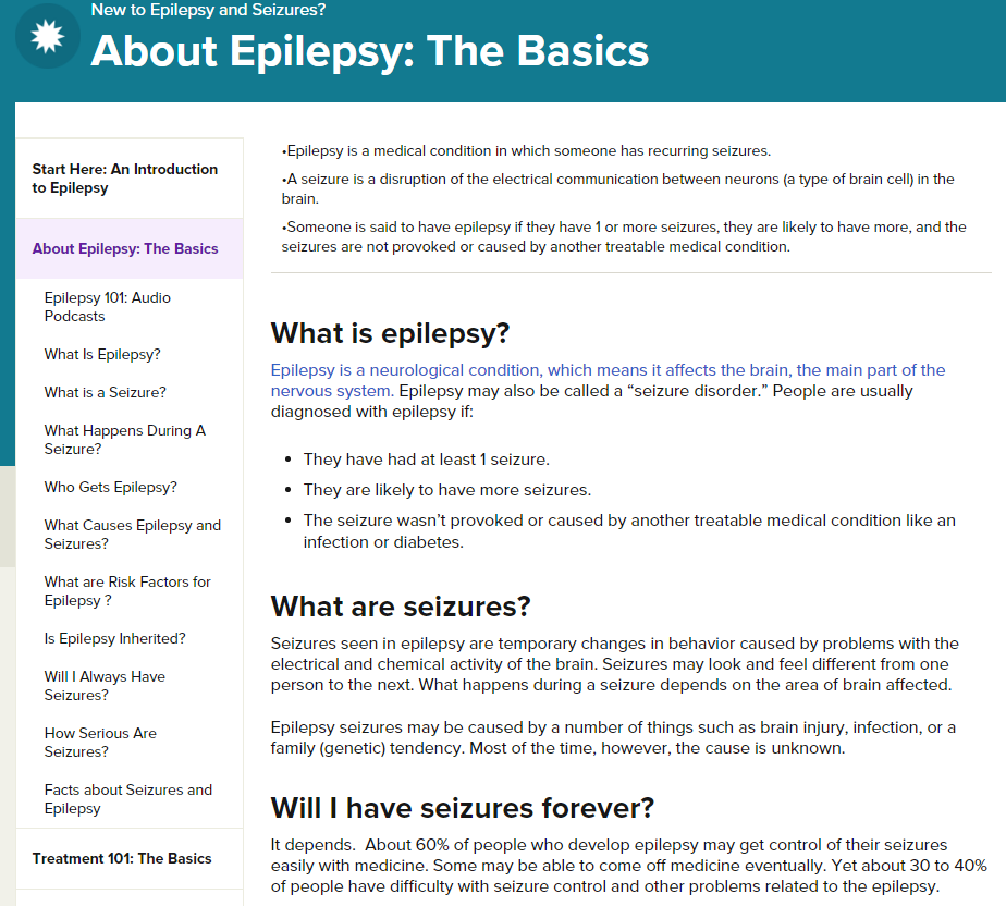 As soon as I was able, I followed the doctor’s advice. And when I got to that page, do you know what I saw? A sidebar navigation for the section. And do you want to know what I did after I finished reading the “About Epilepsy” page? I clicked on every single link in that sidebar. And I read every single page. And if those pages had sub-sections, I clicked on every single one of those links.
I felt educated and confident. I had the information and tools to help keep my daughter healthy. I had found a place that would help me to understand and manage my daughter’s condition. I didn’t need to wade through tags. I didn’t need o know how to spell things correctly in a search box. The information was right there for me in a navigation menu.
This is not a love-fest for the organization’s design. If I were wearing my professional hat, I’d more than likely find a few things to change. But I wasn’t. I was wearing my mom-in-crisis hat. And at that time, the sidebar navigation did exactly what I needed. In reflection, I can’t think of any other tactic that would have worked as well.
Human beings don’t care about dropdowns vs. hamburger menus. And before we are web professionals, we are human beings.