My tenth grade English teacher taught me that every word an author writes is deliberate. She chooses every noun, verb, article, and adjective with precision to create a masterpiece. We as readers will never know just how much work goes into the selection of those words. But we reap the benefits.
And that is why I love this infographic from the Copy Hackers.
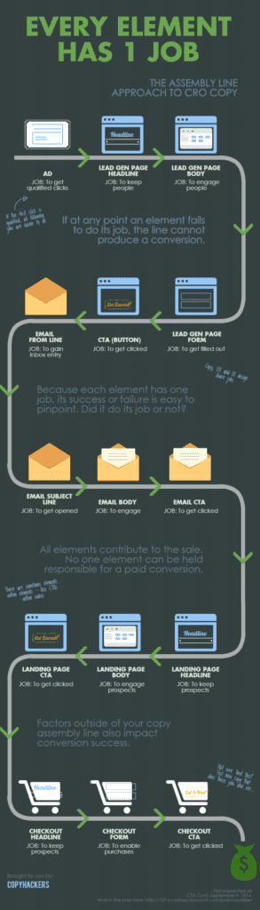
The main purpose of this infographic is to show you where pieces of copy fit on the assembly line of conversion. But it also reinforces what that English teacher taught me. Word choices matter. Word choices and design choices.
As a data fiend, I love this graphic, because it tells you where to look in your data to make improvements. Too many organizations, faced with lower-than-preferred conversion rates, just blow it up. They go after the newest technology and/or expensive redesigns. This graphic says “Whoa! Before we go nuts, let’s find the point of failure.” It may be easier to fix than you think. Fix a button. Change your subject line. Remove a non-required field or two. These are the basic steps to improved conversion rates and user engagement.